Las Taranas
Brand Identity
06-2025
Walle Media
Dordrecht
For my final exam project in the fourth year of my Media Design studies, I was tasked with creating a new visual identity for Hotel Las Taranas, a boutique aparthotel located in the lush landscapes of Villa Riva, Dominican Republic.
The hotel originally had a logo, but it lacked professionalism and consistency. It did not reflect the refined, tranquil, and elegant experience the hotel offers its guests. My assignment was to redesign this identity from the ground up, creating a visual language that communicates luxury, comfort, and a deep connection to nature.
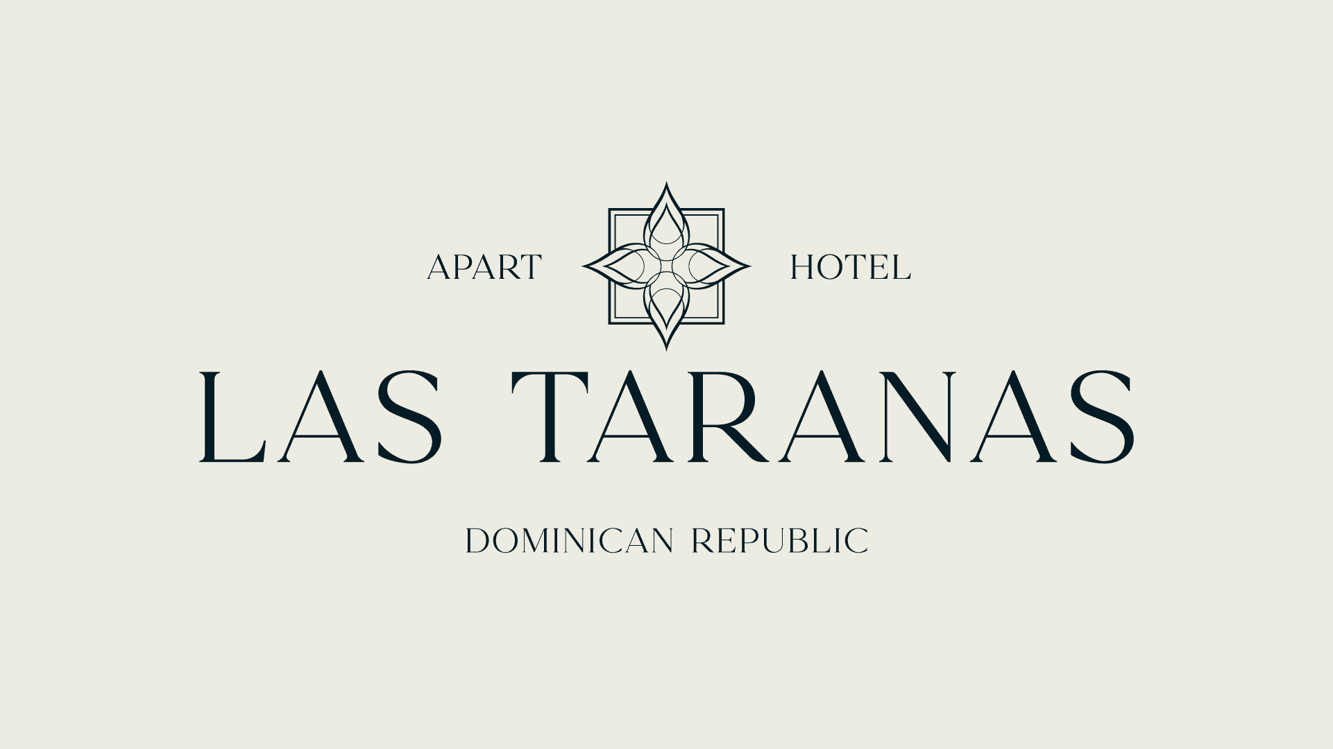
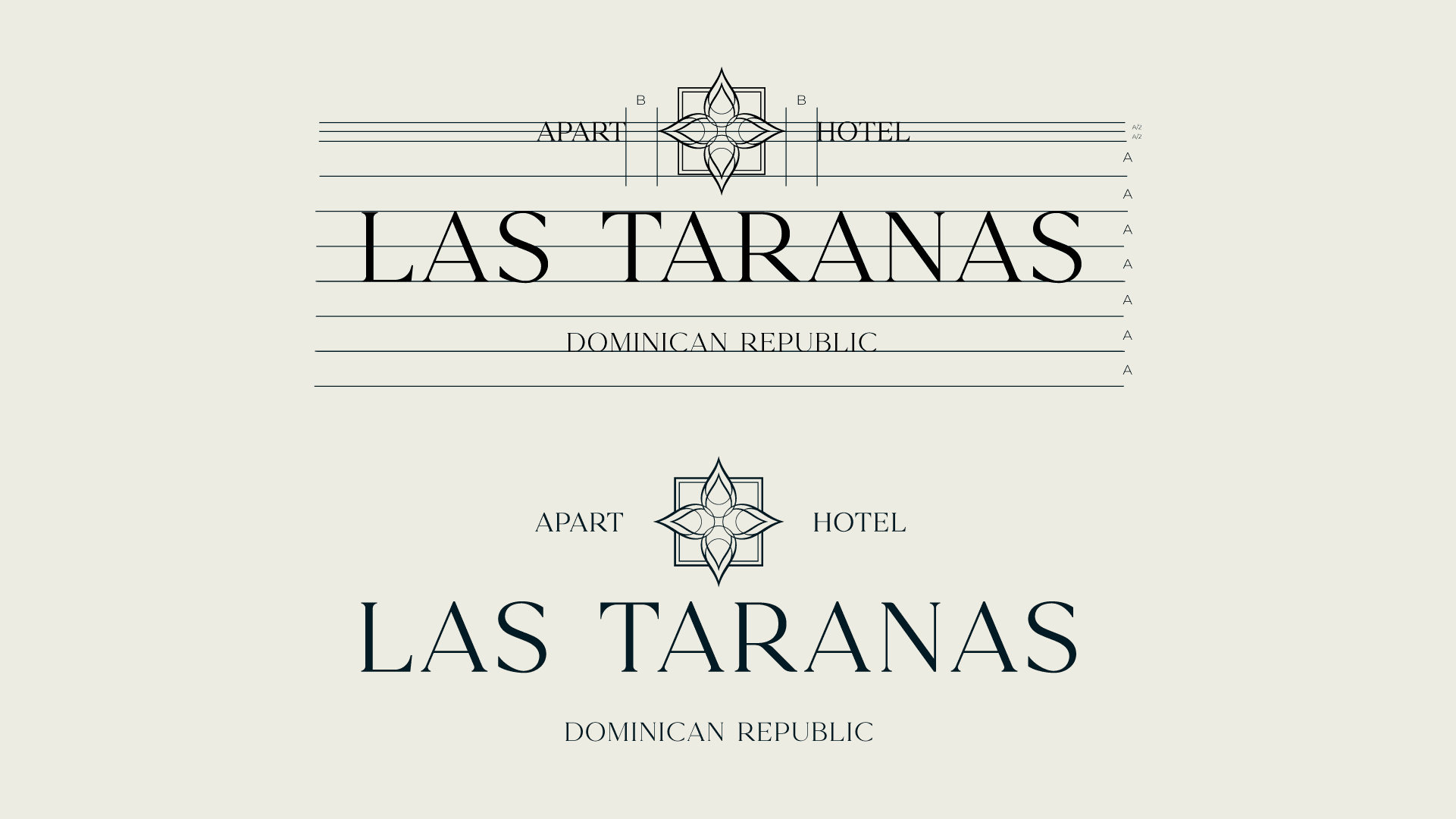
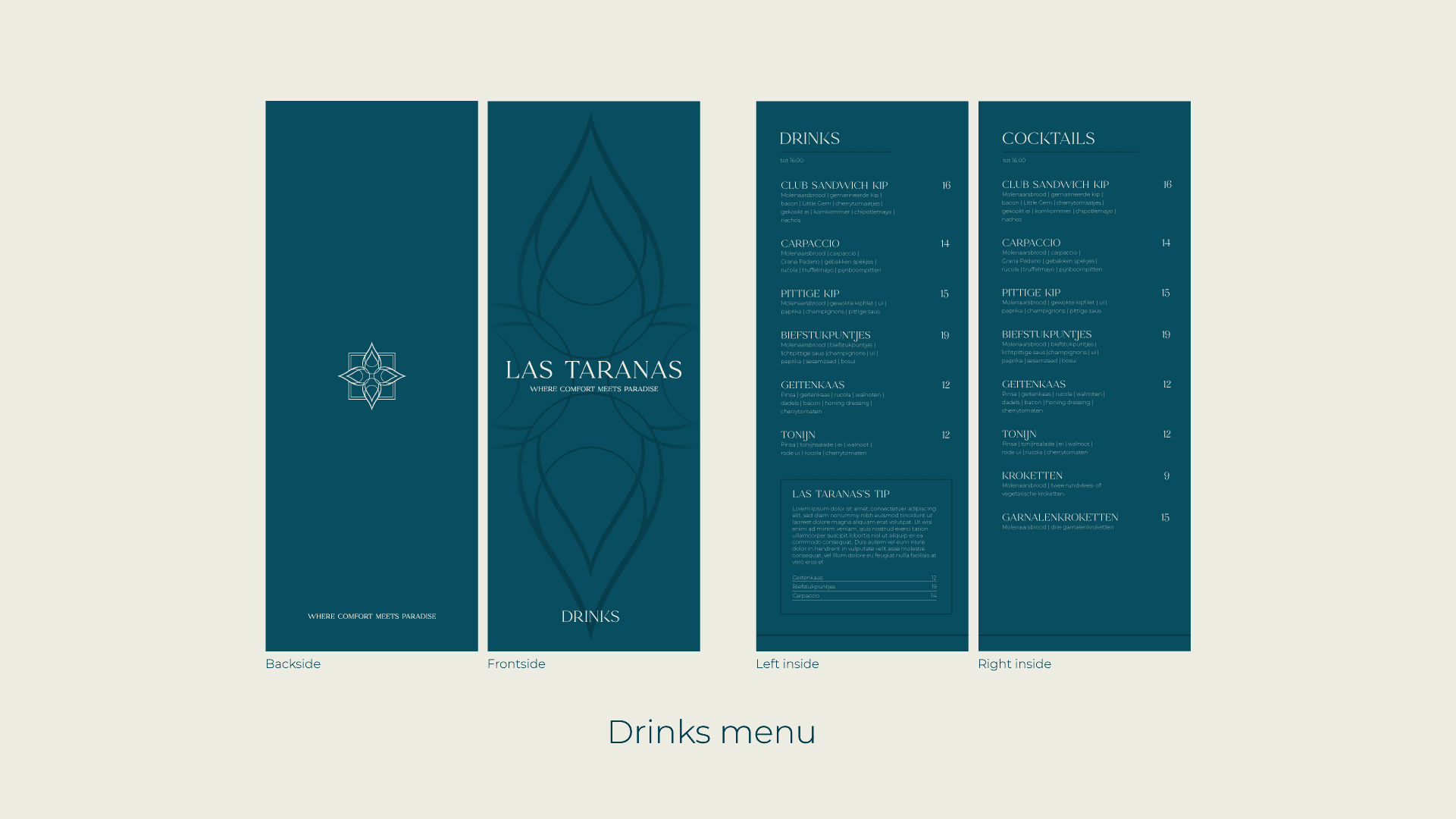
At the heart of the new identity is an abstract flower icon. Inspired by the Dominican Republic’s love for native flowers like the Bayahibe Rose, the icon represents the vibrant yet peaceful nature that surrounds the hotel. Its flowing, symmetrical lines convey elegance and balance, while the generous spacing between the elements creates a sense of openness and calm. The flower is framed by a structured square that symbolizes the order, cleanliness, and reliability the hotel stands for. The fact that the flower appears to bloom beyond this frame subtly hints at growth, freedom, and overcoming boundaries – values that align with the journey of both the hotel and its guests.
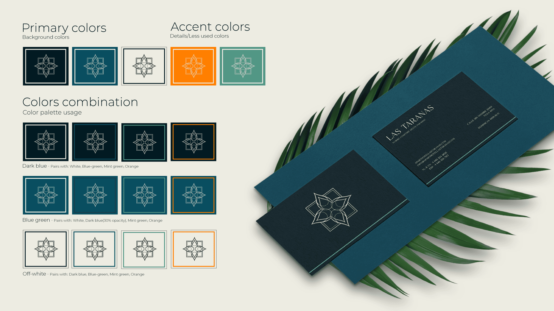
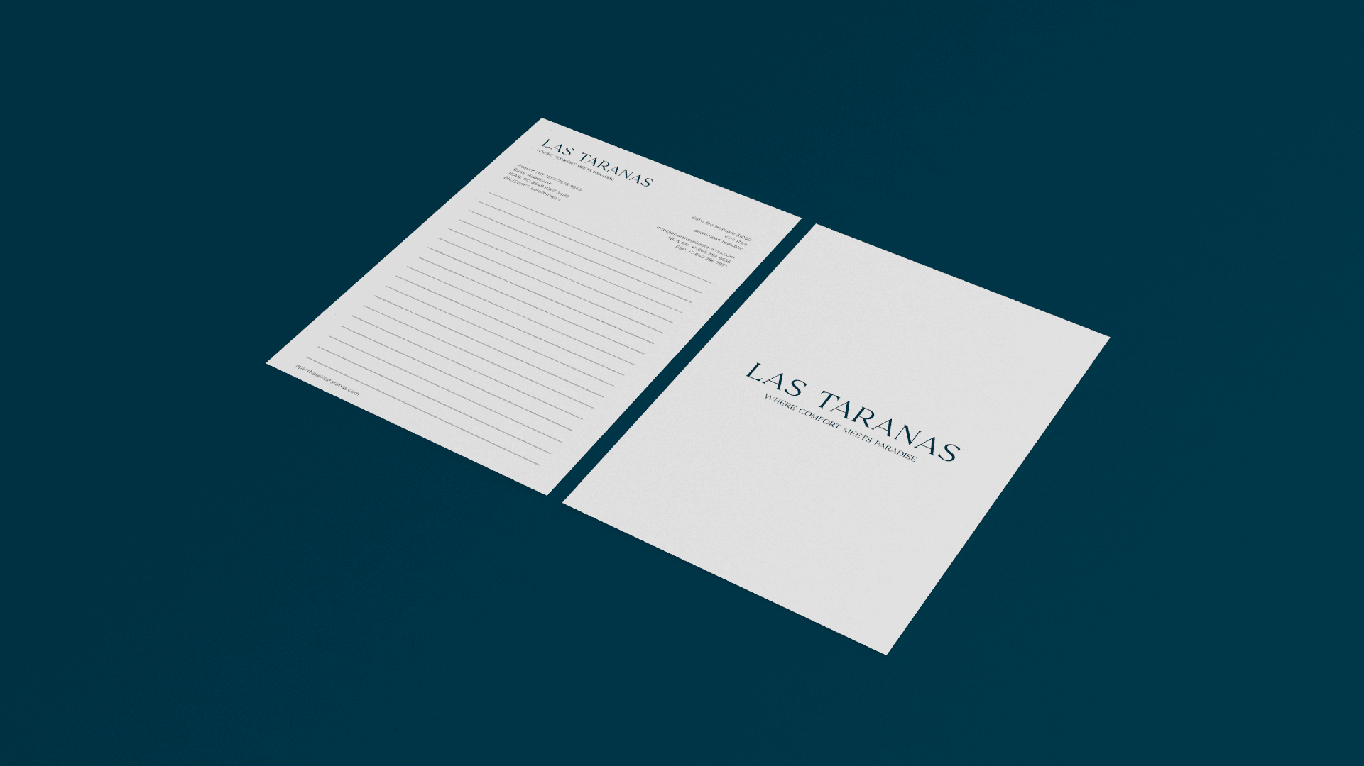
The chosen colors reflect both the natural surroundings and cultural roots of Las Taranas. Deep blue conveys trust and serenity, while a muted green evokes the calm of the nearby jungle and tropical gardens. A vibrant orange acts as a warm accent and nod to the Dutch heritage of one of the hotel’s founders. An off-white base color was used to add softness and warmth to the entire palette, avoiding the coldness of bright white and enhancing the tropical feel of the identity.

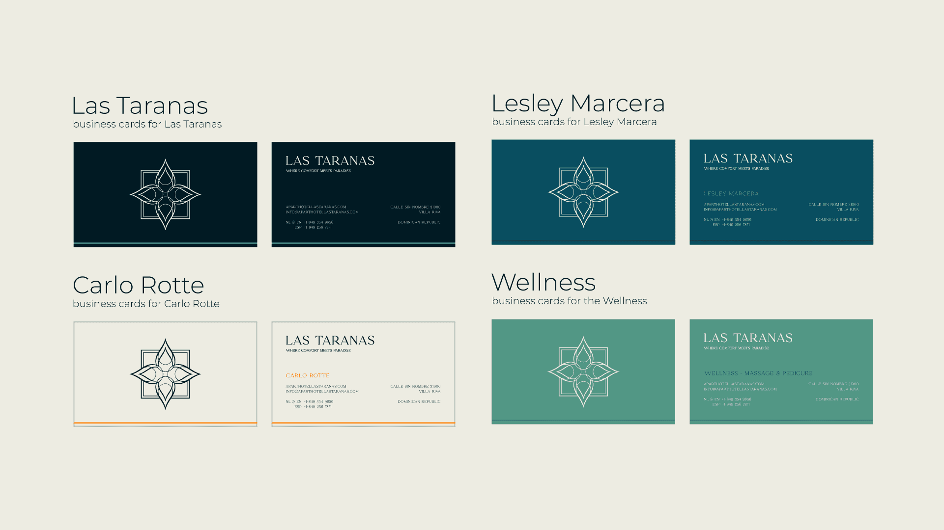
The identity was applied across a full suite of branded materials, including menus, business cards, a banner for airport promotion, and official stationery. Each product was designed with consistency and purpose, ensuring that every guest interaction reinforces the hotel’s brand values. Elegant typography, structured layouts, and subtle patterns based on the flower icon bring unity across all applications.
The result is a refined yet welcoming brand identity that allows Las Taranas to stand out in the luxury hospitality market—offering guests an experience where comfort meets paradise.
< Swipe >